Adding a Bar Chart to an HMI Schema
The Chart gadget in the HMI Editor can display data as a continuous line or, as of IDE version 2.7.18, as a Bar chart. This page covers adding a Chart gadget to your schema, switching its Type to Bar, and binding it to data via Chart Mappings.
Requires Mervis IDE 2.7.18 or later. Earlier builds (e.g. 2.7.14) only offer Line as a Type option for the Chart gadget — Bar is not available.
1. Opening the HMI Gadget Explorer
Open the View menu and select HMI Gadget Explorer.
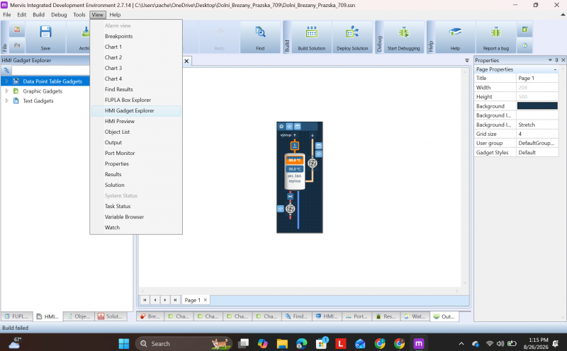
The View menu, with HMI Gadget Explorer highlighted
Inside the explorer, expand Graphic Gadgets. The Chart gadget is listed alongside the other graphical objects (Alarm, Analog Setter, Digital Indicator, etc.).
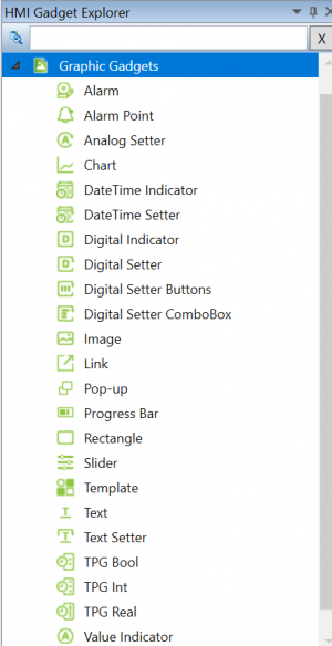
The Graphic Gadgets list, with Chart available
2. Adding the Chart Gadget to Your Schema
Drag the Chart gadget from the explorer onto your schema canvas. Selecting the gadget opens its Properties panel on the right, where the Self and HMI sections let you configure the chart's name, type, and data.
3. Setting the Chart Type to Bar
In the Properties panel, under the HMI section, set Type to Bar. Two additional fields appear that are specific to the Bar type:
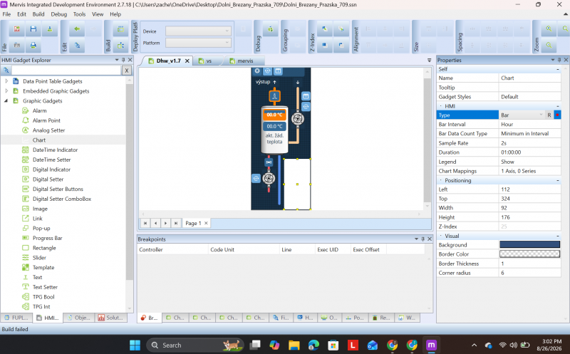
Properties panel with Type set to Bar, showing Bar Interval and Bar Data Count Type
| Field | Description |
| Type | Set to Bar to render the chart as bars instead of a continuous line. |
| Bar Interval | The time interval each bar represents (e.g. Hour). |
| Bar Data Count Type | How the value for each bar is calculated from the samples collected within that interval (e.g. Minimum in Interval). |
The chart's other standard properties (Sample Rate, Duration, Legend) apply the same way regardless of Type, and are not specific to Bar charts.
4. Binding Data via Chart Mappings
Click into the Chart Mappings field in the Properties panel to open the Chart Mappings dialog. This dialog has two parts: axis definitions (top) and data series (bottom).
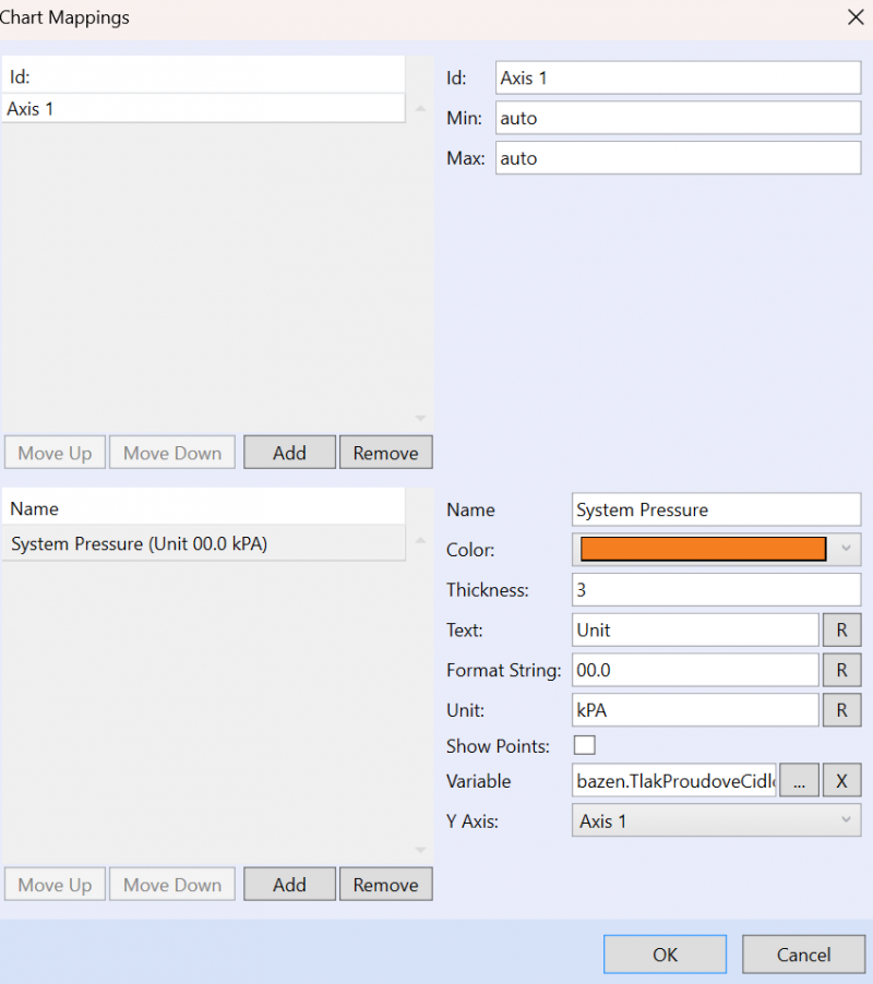
Chart Mappings dialog, with one axis and one series configured
Axis Fields
| Field | Description |
| Id | Name identifying this axis. Referenced by each series' Y Axis setting below. |
| Min | The minimum value of the axis scale. Set to auto to scale automatically based on the incoming data. |
| Max | The maximum value of the axis scale. Set to auto to scale automatically based on the incoming data. |
Use Add / Remove / Move Up / Move Down to manage multiple axes, useful when plotting series with very different value ranges on the same chart.
Series Fields
| Field | Description |
| Name | Display name for this data series, shown in the chart legend. |
| Color | The color used to render this series' bars (or line, for Line-type charts). |
| Thickness | The bar or line thickness, in pixels. |
| Text | Label text shown alongside the series value. |
| Format String | Numeric format applied to displayed values (e.g. 00.0 displays one decimal place). |
| Unit | The unit label appended to displayed values (e.g. kPA). |
| Show Points | Toggles whether individual data points are marked on the chart. |
| Variable | The data point this series is bound to. |
| Y Axis | Which of the axes defined above this series' values are plotted against. |
Use Add / Remove / Move Up / Move Down to manage multiple series on the same chart.
Related Pages
- HMI graphical objects – Overview of all Graphic Gadgets, including Chart.
- Description of HMI Editor – General introduction to the HMI Editor.