HMI graphical objects
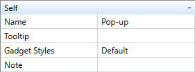
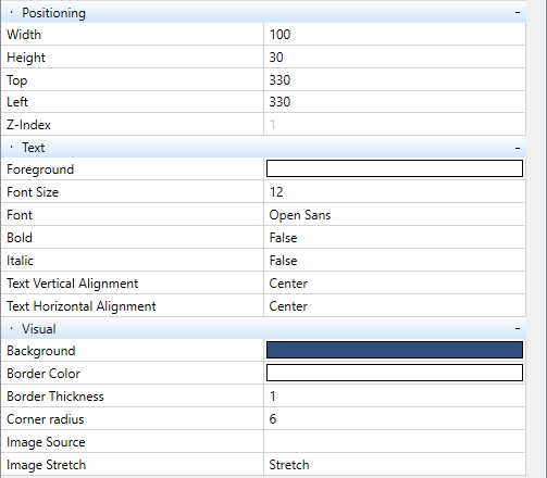
Each of the graphical HMI objects has its specific properties described below. The visual properties are common for all objects:
- Name - Object name (only in HMI editor)
- Tooltip - Help (appears, for example, after hovering the mouse)
- Gadget styles - A reference to the object's custom style viz. Creating styles
- Width - object width in pixels
- Height - object height in pixels
- Top - Y-coordinate of the object on the page, from top to bottom
- Left - X-coordinate of the object on the page, from left to right
- Z-index - Z-coordinate of the object on the page. This value can be changed by buttons in the ribbon:
Foreground - Colour of the displayed text
- Font size - Size of the displayed text
- Font - Font type of the displayed text
- Bold - Bold text formatting
- Italics - Italics text formatting
- Text vertical alignment - Vertical positioning of the text inside of the object
- Text horizontal alignment - Horizontal positioning of the text inside of the object
- Background - Object background colour
- Border color - Colour of the object border
- Border thickness - Object border thickness in pixels
- Corner radius - The higher value, the more “roundness”. Corner radius a/2 of an a × a square results in a circle.
- Image source - Path to an image which should be displayed on the object background
- Image stretch - If checked, the image size is stretched / shrinked so as to fit the object size.
Menu item types
Alarm
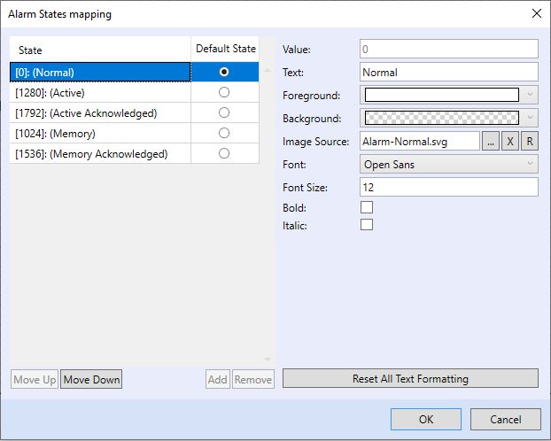
Indicator of alarm states. The object displays status of an alarm block using text or image. An alarm block has five possible states:
To keep full functionality, the object must be linked with blocks “Lib.Core.V1_1.BD56_SingleAlarmMemoryDelay” or “Lib.Core.V1_1.BD57_AlarmMemoryExt”.
The “Alarm status” object properties are:
- Variable - select the whole alarm block as the attached variable
- AcknowledgeVariable - the variable will be attached automatically
- ResetVariable - the variable will be attached automatically
- AlarmStatusVariable - the variable will be attached automatically
- Confirm Alarm Acknowledge Message - Text to display if the alarm has to be acknowledged
- Confirm Alarm Reset Message - Text to display if the alarm has to be reset
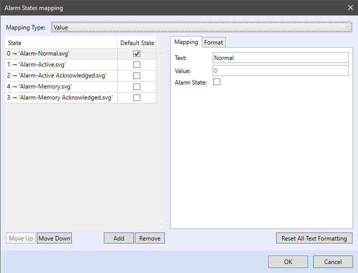
- States mapping - Dialog to set visual properties of the displayed alarm states: define texts or images for each alarm state here.
Alarm point
Indicator of alarm states. The object displays status of an alarm block using text or image. An alarm block has five possible states:
To keep full functionality, the object must be linked alarm point funkction blocks “Lib.Core.V1_1.BD56_SingleAlarmMemoryDelay” or linked alarm point funkction block “Lib.Core.V1_1.BD57_AlarmMemoryExt”
The “Alarm status” object properties are:
- Variable - select the whole alarm block as the attached variable
- Confirm Alarm Acknowledge Message - Text to display if the alarm has to be acknowledged
- Confirm Alarm Reset Message - Text to display if the alarm has to be reset
- States mapping - Dialog to set visual properties of the displayed alarm states: define texts or images for each alarm state here.
Analog Setter
Object to set analog value.
The “Analog Setter” object properties are:
Variable - Attached variable
- Text - Fixed text to be displayed, followed by value and units
- Format - Definition of the format of displayed value, the “#” characters represent positions related to the decimal point
- Unit - Physical unit of the displayed value, will be displayed after the value
- Min Value - Minimum value which can be set using Analog Setter
- Max Value - Maximum value which can be set using Analog Setter
- Step Value - Decrement or increment on clicking of the - or + button
In the Analog setter properties it is also possible to define a path to new images for a component which increases and decreases the value. This is in the Visualisation section.
Link
This object is button to open another page (panel) to display or link to internet page..
It has following properties:
- Text - Text to be displayed on the button
- Link Action - Choose between “Page” - click on another page in the definition or “URL” - click through to the internet page
- Page ID - The page to jump to
Pop-up
The pop-up object displays a graphic template in a pop-up windowfunction block. Typically, this can be a graphical function block with regulation settings in a specific hotel room.
Its properties are:
- Variable - Selection of a variable (function block or program)
- Text - The text that will be displayed on the pop-up
- Template - Selection of a graphic template that will display
Progress bar
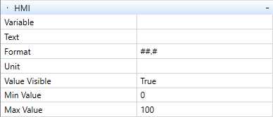
The progress bar object is used to visualize progress, which can be textually accompanied in the form of percentage.
Its properties are:
- Variable - Selection of a variable
- Text - The text that will be displayed on the progress bar
- Format - Definition of the format of displayed value, the “#” characters represent positions related to the decimal point
- Unit - Physical unit of the displayed value, will be displayed after the value
- Value Visible - show/hide entire object content (Text, Unit, Variable value)
- Min Value - Minimum value which can be set using Progress bar
- Max Value - Maximum value which can be set using Progress bar
Chart
The “Chart” is used for trending of one or more variables in the graph. This type of an object is supported only for the PLC webserver definition.
The “Chart” object properties are:
- Type – graph draw mode (right now the only one available is line)
- Sample Rate – variables sampling interval
- Duration – chart timeline range
- Legend – hide/show graph legend
- Chart Mappings – new variables (series) adding, range editing and axes properties
DateTime Indicator
This object displays either the PLC time, or any time value of a DT-type variable.
It has following properties:
Variable - Attached variable
- Text - Fixed text to be displayed, followed by the date value
- Format - Definition of the format of date and time - select one to fit your country standards
DateTime Setter
This object displays either the PLC time, or any time value of a DT-type variable. The date and time can also be set here.
It has following properties:
- Variable - Path to the attached variable. To set PLC system date and time (RTC), proceed as follows:
- for a terminal.graph type template select “the complete PLC” (the root item of the variables tree)
- for a web.graph type template select “Use Target Device RTC”.
- Text - Fixed text to be displayed, followed by the date value
- Format - Definition of the format of date and time - select one to fit your country standards (d = day, m = month, y = year, h = hours, m = minutes, s = seconds)
Digital Indicator
Displays a predefined text according to a discrete numerical value.
The “Digital Indicator” object properties are:
Variable - Path to the variable attached to the object
- States mapping - Editor which edits integer values and corresponding texts of the states
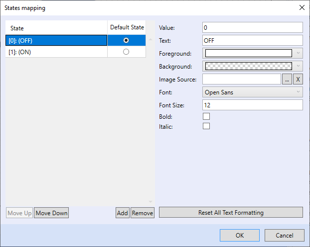
States mapping:
In States mapping the states corresponding to variable values are mapped. The values are Integer or “True(1)/False(0)”. Edit the status text, its visual properties, font, font size, bold type and italics, and optional image.
Digital Setter
Sets a predefined discrete numerical value (typed as integer, byte, uint… - maximum 16 bits) according to a selected state text from the collection.
The “Digital Setter” object properties are:
Variable - Path to the variable attached to the object
- States mapping - Editor which edits integer values and corresponding texts of the states
In States mapping the states corresponding to variable values are mapped. The values are Integer or “True(1)/False(0)”. Edit the status text, its visual properties, font, font size, bold type and italics, and optional image.
Use maximum 16bit types. Do not use 32 and 64 bit types (dint, lint).
Digital Setter Buttons
This object allows you to set the variable value using states defined in “States mapping” editor. After its creation the box is separated in several areas (buttons). Every area is assigned to one specific state. Clicking on the area causes variable to change its value to the one defined in the state. Current state of the variable is represented by the background color change of the appropriate area.
Unlike the others this object has a different “Visual” tab. The tab includes extra parameter called “Separator thickness” that defines thickness of the border which separates value areas. There is also another extra parameter called “Orientation” which allows you to switch between vertical and horizontal buttons order (a column or a row).
The “Digital Setter Buttons” object properties are:
Variable - Path to the variable attached to the object
- States mapping - Editor which edits integer values and corresponding texts of the states
The colour set as “Background” in a specific state settings is shown only when a corresponding button is pressed. The button background color in the normal state is determined by the settings in the visualisation tab. There is also an option to select the image that will be shown instead of a background and a text.
Digital Setter ComboBox
Sets a predefined discrete numerical value according to a selected state text from the collection. Clicking the object opens a menu where the required stae can be selected.
The “Digital Setter” object properties are:
Variable - Path to the variable attached to the object
- States mapping - Editor which edits integer values and corresponding texts of the states
In States mapping the states corresponding to variable values are mapped. The values are Integer or “True(1)/False(0)”. Edit the status text, its visual properties, font, font size, bold type and italics, and optional image.
Image
This object displays an image taken from an image file.
Select the image path and filename in Properties.
Rectangle
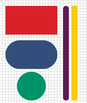
This object is just a generic shape which can be used as a part of your graphic definition. You can use it as a background for the other active objects or as a simplified representation of some technology elements (pipes, boiler etc.). In the default settings the object is rendered as a generic rectangle with rounded corners. You can adjust the radius from square corners to circle-like. Besides that there is also an option to change object size and color.
Examples of “Rectangle” use:
Slider
The slider allows set a value in a defined range of values (minimum and maximum).
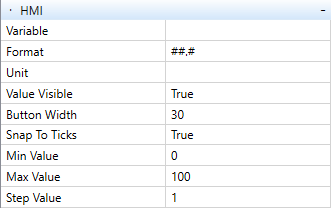
The “Slider” object properties are:
- Variable - Attached variable
- Format - Definition of the format of displayed value, the “#” characters represent positions related to the decimal point
- Unit - Physical unit of the displayed value, will be displayed after the value
- Value Visuble - show/hide all text on object (Text, Variable, Unit)
- Button Width - Setting the size of the width of the “-” and “+” buttons
- Snap To Ticks - Snapping to commas with a fixed interval
- Text - Fixed text to be displayed, followed by value and units
- Min Value - Minimum value which can be set using Slider
- Max Value - Maximum value which can be set using Slider
- Step Value - Decrement or increment on clicking of the - or + button
In the Slider properties it is also possible to define a path to new images for a component which increases and decreases the value. This is in the Visualisation section.
Template
You can use the “Template” object for creation of specific part of your HMI definition. This object is always assigned to some function block or a program. Source for this type of an element can be created while switched in full mode by choosing appropriate template type.
See chapter: Creating a graphic template for Terminal.
Text
Displays a fixed text. It is used mostly in the main screen (site name), naming of menu branches (Setpoints, Heating, AHUs, Lights, etc.), or to create a submenu with supplier/service contact data (such as web pages and phone number).
The “Static Text” object properties are:
- Text - Text to be displayed
Text Setter
This element can be used for reading/writing of string variables.
In default settings this object shows value of the mapped variable. By clicking on the object you can edit the value and save it back to the variable in the dialog window. The header of the dialog shows the name of an element. Above the editable field with the current value you can see the name of the assigned variable.
The “Text setter” object properties are:
- Variable - field for variable assignement (sring variable only)
- Text - Text to be displayed before the variable value
- Format - regarding this object the field needs no editing of the default value (#)
- Unit - the text to be displayed after the variable value
- Value Visible - show/hide entire object content (Text, Unit, Variable value)
TPG Bool
The “TPG Bool” object displays and edits a “Lib.Hvac.V1_0.T17_Boolean_Scheduler” or “Lib.Hvac.V1_0.T17_Boolean_Scheduler_Base” block.
The “TPG Bool” object properties are:
- Variable - Path to the variable attached to the object - select the complete time program block here
- Value visible - enable if the actual time scheduler output value shall be displayed at the TPG (time program) object. If disabled, the TPG object is just a link to the TPG scheduler editor.
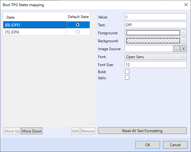
In States mapping the states corresponding to variable values are mapped. The values are Integer or “True(1)/False(0)”. Edit the status text, its visual properties, font, font size, bold type and italics, and optional image.
TPG Int
The “TPG Int” object displays and edits a “Lib.Hvac.V1_0.T19_Integer_Scheduler” or “Lib.Hvac.V1_1.T19_Integer_Scheduler_Base” block.
The “TPG Int” object properties are:
- Variable - Path to the variable attached to the object - select the complete time program block here
- Value visible - enable if the actual time scheduler output value shall be displayed at the TPG (time program) object. If disabled, the TPG object is just a link to the TPG scheduler editor.
In States mapping the states corresponding to variable values are mapped. The values are Integer or “True(1)/False(0)”. Edit the status text, its visual properties, font, font size, bold type and italics, and optional image.
TPG Real
The “TPG Real” object displays and edits a “Lib.Hvac.V1_0.T18_Real_Scheduler” or “Lib.Hvac.V1_0.T18_Real_Scheduler_Base” block.
The “TPG Real” object properties are:
- Variable - Path to the variable attached to the object - select the complete time program block here
- Text - Fixed text to be displayed, followed by value and units
- Format - Definition of the format of displayed value, the “#” characters represent positions related to the decimal point
- Unit - Physical unit of the displayed value, will be displayed after the value
- Value visible - enable if the actual time scheduler output value shall be displayed at the TPG (time program) object. If disabled, the TPG object is just a link to the TPG scheduler editor.
- Min Value - Minimum value which can be set using Analog Setter
- Max Value - Maximum value which can be set using Analog Setter
- Step Value - Decrement or increment on clicking of the - or + button
It is also possible to define a path to images for a component which increases and decreases the value. This is in the Visualisation section.
Value Indicator
Display of analogue value.
The “Value Indicator” object properties are:
Variable - Attached variable
- Text - Fixed text to be displayed, followed by value and units
- Format - Definition of the format of displayed value, the “#” characters represent positions related to the decimal point
- Unit - Physical unit of the displayed value, will be displayed after the value
