This is an old revision of the document!
Mervis Analytics
Mervis Analytics is a set of tools for HVAC and energy data analysis. Some of the analysis can be made directly in Mervis SCADA some are done in other tools that use Mervis SCADA as data source.
Carpet charts
Carpet chars do represent an efficient way for first visual data analysis. Beside classical carpet chart (or heatmap) we do use more sophisticated charts with aggregations. The basic principle is similar to pivot tables and pivot charts. User defines columns, rows and fold function. Each cell's value then represents aggregation of all values that do belong to the particular cell (e.g. average of of all values that were measured on Mondays between 2 and 3 am).
Below are examples of useful carpet chars applications.
Electrical heating
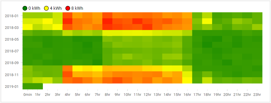
Charts capture average electrical energy consumption during a week. In this case, electricity is used for heating as well, as can be seen from the first chart (horizontal axis: hour in day, vertical axis: month). There is clear start and end of heating season.
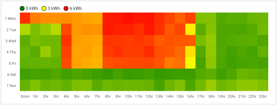
 Detailed look at weekly schedule shows that heating starts at 4 am during working days, except of Monday, when it starts at midnight, see next chart (horizontal axis: hour in day, vertical axis: day of week). There is a clear end of working hours, as expected in case of this office building.

Cooling outside working hours
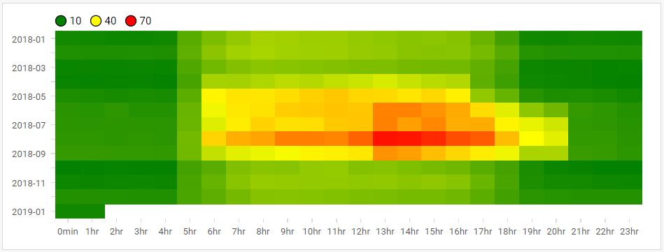
Increase of electrical energy use during summer is usually excepted in case of office buildings during summer. Carpet charts are perfect tool for quick evaluation of cooling regimes. Next chart is an example of a wrong cooling regime setting. There is an increase of energy consumption during summer, as expected. However, one can observer increase also after opening hours (after 4 pm).

CO2 concentration
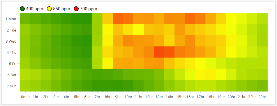
Evaluation of CO2 by means of carpet chart can also provide quick overview. Data from IoT indoor air quality sensor are evaluated, in the next example. There is increase of CO2 concentration during opening hours. Overal CO2 concentrations are or but slow decrease of CO2 concentrations during evening and night reveals absence of ventilation.

AHU pressure difference
HVAC appliance operation can be investigated by means of carpet charts as well. Bellow is a carpet chart (horizontal axis: day, vertical axis: hour of day) of AHU pressure difference. It shows regular regime with some irregularities at the end of shown interval. Note that these irregularities cannot be easily found using a classical line chart.
