Table of Contents
Graphs
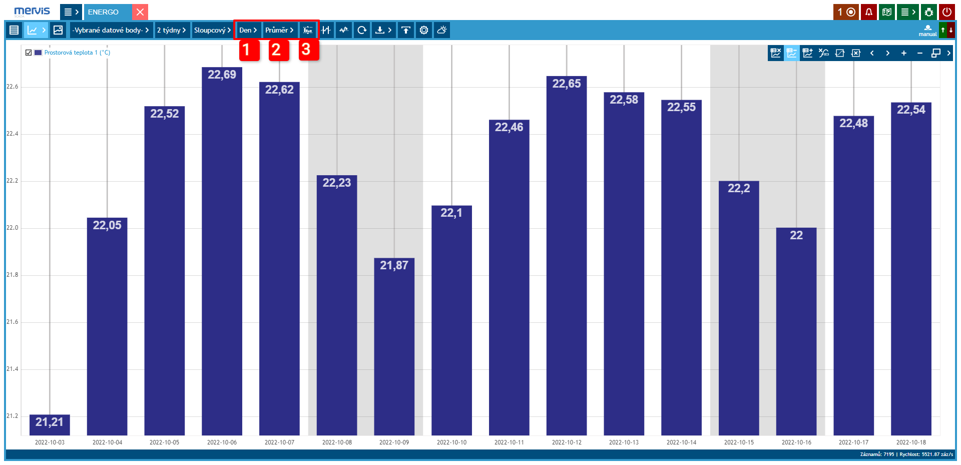
Marked data points can be displayed using a graph. There are several types of displays available. Each has its specific settings.
Graph Control
Graph control is common for all types of graphs and allows:
Line Graph
This is the most commonly used type of graph. In most cases, the desired information can be found in this display. It is especially suitable for comparing multiple variables over time.
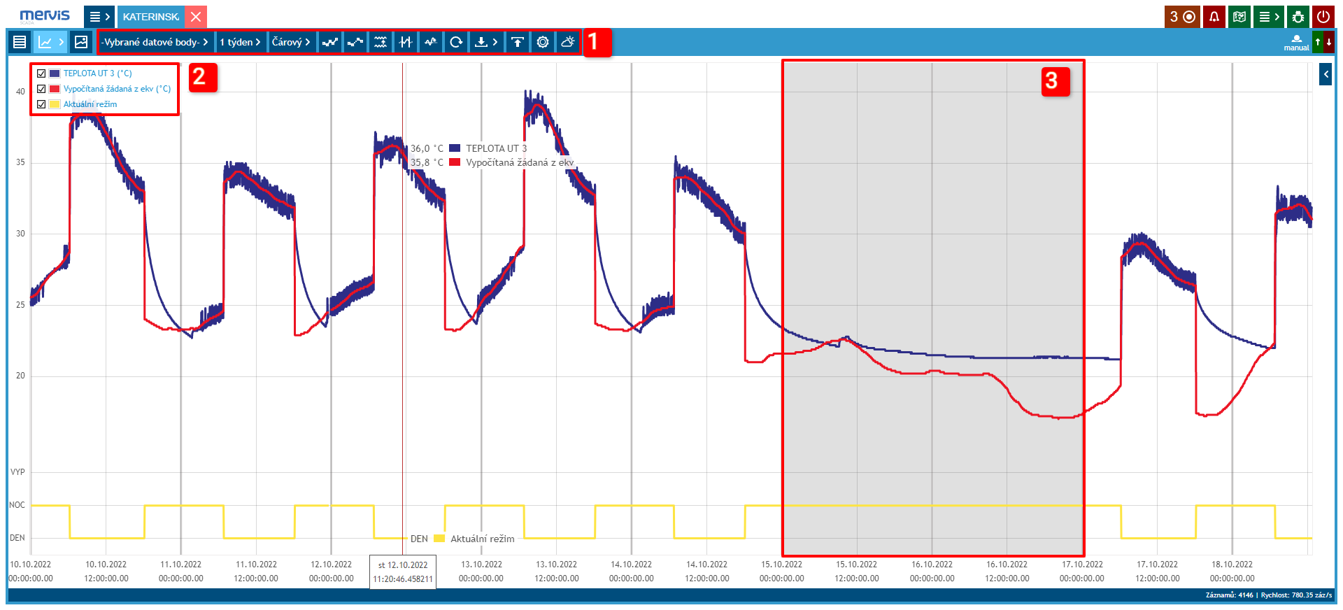 Sizes of the output measured and desired temperatures of the heating circuit and the current operating mode.
1 Selection and Settings of the Graph
2 Legend
By clicking on the legend, it is possible to show/hide data assigned to it. Labels are also pinned directly to the time axis.
3 Weekend Marking
Gray background marks Saturday and Sunday.
Carpet Graph
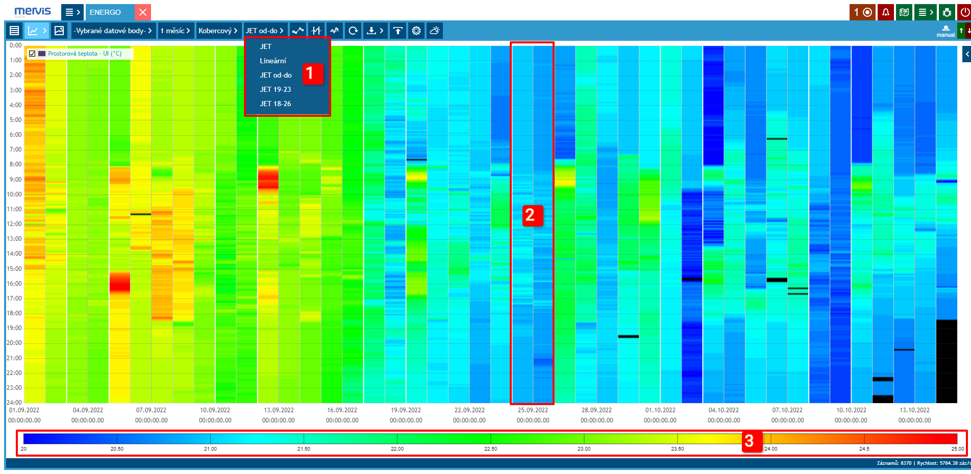
Suitable for detailed display of 1 variable over a longer time period (e.g., 1 month). This graph is useful for status variables, where the device's mode can be displayed for individual days in the selected period. This way, other variables (e.g., room temperature) can also be displayed.
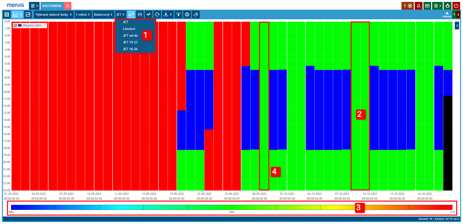 Current operating mode of the heating circuit. On the x-axis, individual days of the displayed period are visible. On the y-axis, hours in the day are visible.
1 Color Scale Settings
2 Weekend Marking
Vertical white lines separate the workweek, Saturday, and Sunday.
3 Color Scale Legend
4 September 28th was a public holiday. In the graph, it is clearly visible that the weekend operation was observed
Modulo Graph
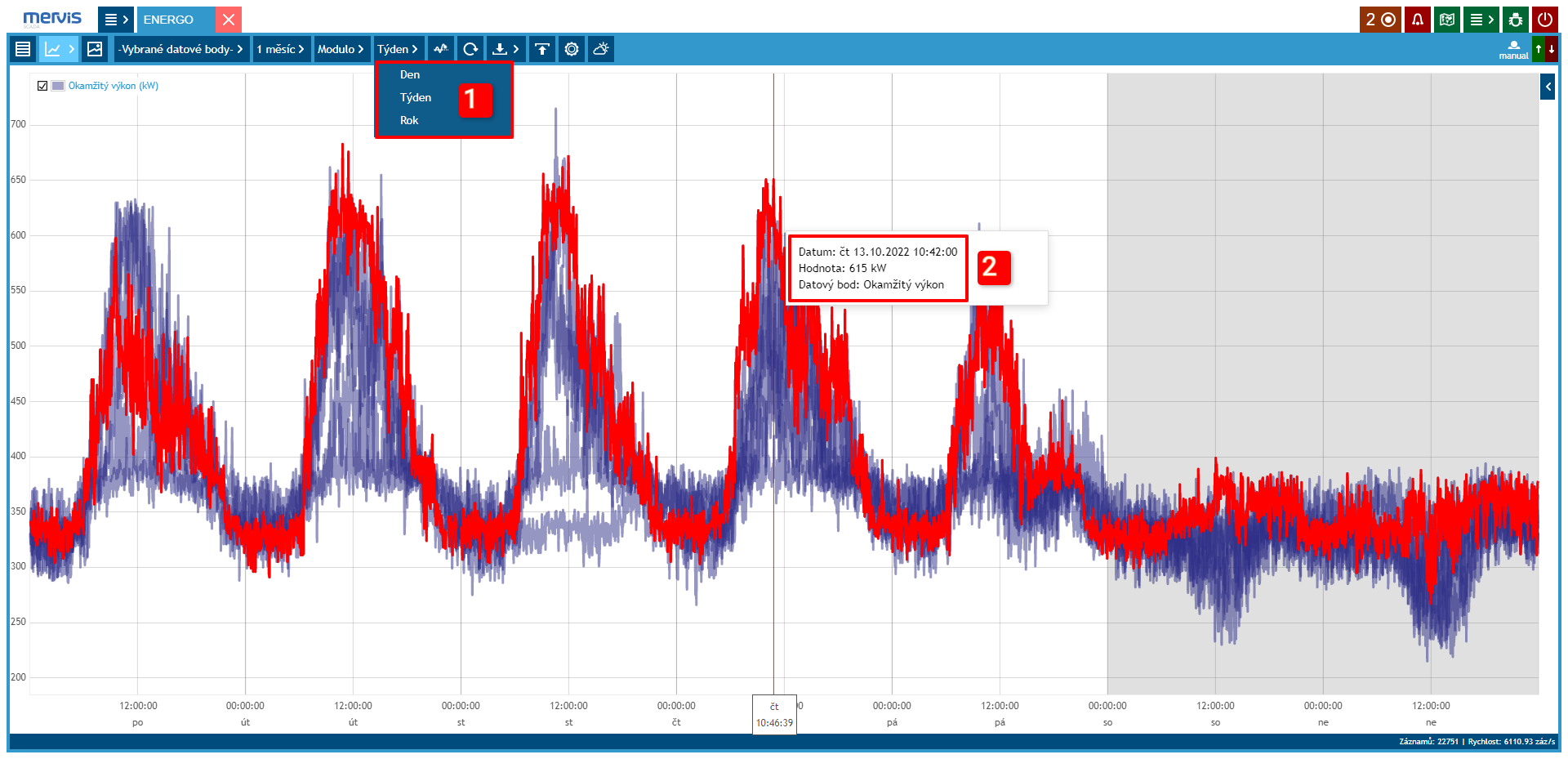
The Modulo graph is suitable for displaying a “characteristic” profile - profiles from time-matched periods (days, weeks, etc.) are displayed on top of each other, making it easy to identify significant deviations from the typical profile.
1 Time Period Settings
In this type of graph, it is possible to set the period to weeks, months, or years.
2 Graph Labels
Display: date, time, value, and data point name


